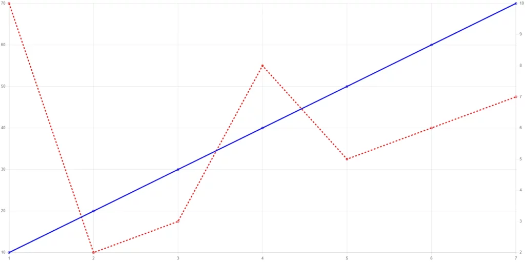
While I was practicing Chart.js in my Python Flask project, I aimed to create a chart that can display multiple Y-axes. ( Each dataset should have its own corresponding Y-axis. )
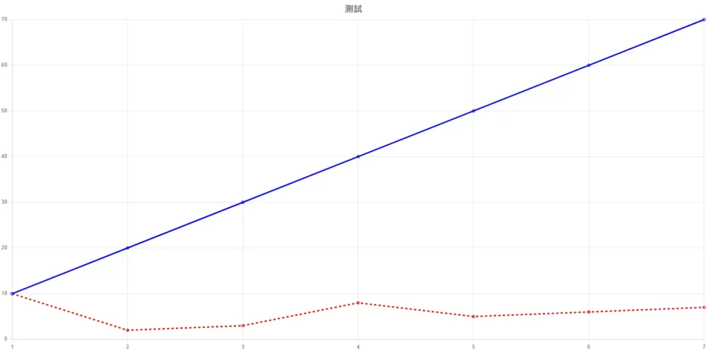
We can see there are two datasets with different values.
⬇ And this is what it will look like
If the two datasets have a small difference, it’s manageable.
However, if there’s a significant disparity between them, or they aren’t even in the same unit, yet you still want to display them together, that’s where the need for two Y-axes arises to solve this issue!
var uagb_data = {"ajax_url":"https:\/\/zyrastory.com\/wp-admin\/admin-ajax.php","uagb_masonry_ajax_nonce":"b90f501051"};
var uagb_data = {"ajax_url":"https:\/\/zyrastory.com\/wp-admin\/admin-ajax.php","uagb_masonry_ajax_nonce":"b90f501051","uagb_grid_ajax_nonce":"ba32b183e3"};
( function() {
let elements = document.querySelectorAll( '.uagb-post-grid.uagb-block-c821bea6 .uagb-post-pagination-wrap a' );
elements.forEach(function(element) {
element.addEventListener("click", function(event){
event.preventDefault();
const link = event.target.getAttribute('href').match( /\/page\/\d+\// )?.[0] || '';
const regex = /\d+/; // regular expression to match a number at the end of the string
const match = link.match( regex ) ? link.match( regex )[0] : 1; // match the regular expression with the link
const pageNumber = parseInt( match ); // extract the number and parse it to an integer
window.UAGBPostGrid._callAjax({"btnBorderStyle":"none","overallBorderColor":"","block_id":"c821bea6","categories":"215","displayPostExcerpt":false,"displayPostComment":false,"displayPostImage":false,"imgSize":"medium","linkBox":false,"orderBy":"rand","excludeCurrentPost":true,"postPagination":true,"pageLimit":0,"imageRatio":"2-3","imgEqualHeight":true,"UAGHideMob":true,"UAGResponsiveConditions":true,"btnBorderLink":true,"btnBorderRadiusLink":true,"overallBorderLink":true,"overallBorderRadiusLink":true,"inheritFromTheme":true,"postType":"post","postDisplaytext":"No post found!","taxonomyType":"category","postsToShow":6,"enableOffset":false,"postsOffset":0,"displayPostDate":true,"excerptLength":15,"displayPostAuthor":false,"displayPostTitle":true,"displayPostTaxonomy":false,"hideTaxonomyIcon":true,"taxStyle":"default","displayPostTaxonomyAboveTitle":"withMeta","imgPosition":"top","bgOverlayColor":"#000000","overlayOpacity":"50","displayPostLink":true,"newTab":false,"ctaText":"Read More","btnHPadding":"","btnVPadding":"","columns":3,"tcolumns":2,"mcolumns":1,"align":"left","width":"wide","order":"desc","rowGap":20,"rowGapTablet":20,"rowGapMobile":20,"columnGap":20,"bgType":"color","bgColor":"#f6f6f6","titleTag":"h4","titleFontSize":"","titleFontSizeType":"px","titleFontFamily":"","titleLineHeightType":"em","titleLoadGoogleFonts":false,"metaColor":"","highlightedTextColor":"#fff","highlightedTextBgColor":"#3182ce","metaFontSize":"","metaFontSizeType":"px","metaFontFamily":"","metaLineHeightType":"em","metaLoadGoogleFonts":false,"excerptColor":"","excerptFontSize":"","excerptFontSizeType":"px","excerptFontFamily":"","excerptLineHeightType":"em","excerptLoadGoogleFonts":false,"displayPostContentRadio":"excerpt","ctaBgType":"color","ctaBgHType":"color","ctaFontSize":"","ctaFontSizeType":"px","ctaFontFamily":"","ctaLineHeightType":"em","ctaLoadGoogleFonts":false,"paddingTop":20,"paddingBottom":20,"paddingRight":20,"paddingLeft":20,"contentPadding":20,"ctaBottomSpace":0,"ctaBottomSpaceTablet":0,"ctaBottomSpaceMobile":0,"imageBottomSpace":15,"titleBottomSpace":15,"metaBottomSpace":15,"excerptBottomSpace":25,"contentPaddingUnit":"px","rowGapUnit":"px","columnGapUnit":"px","excerptBottomSpaceUnit":"px","paginationSpacingUnit":"px","imageBottomSpaceUnit":"px","titleBottomSpaceUnit":"px","metaBottomSpaceUnit":"px","ctaBottomSpaceUnit":"px","paddingBtnUnit":"px","mobilePaddingBtnUnit":"px","tabletPaddingBtnUnit":"px","paddingUnit":"px","mobilePaddingUnit":"px","tabletPaddingUnit":"px","isPreview":false,"taxDivider":", ","titleLetterSpacing":"","titleLetterSpacingType":"px","metaLetterSpacing":"","metaLetterSpacingType":"px","ctaLetterSpacing":"","ctaLetterSpacingType":"px","excerptLetterSpacing":"","excerptLetterSpacingType":"px","useSeparateBoxShadows":true,"boxShadowColor":"#00000070","boxShadowHOffset":0,"boxShadowVOffset":0,"boxShadowBlur":"","boxShadowSpread":"","boxShadowPosition":"outset","boxShadowColorHover":"","boxShadowHOffsetHover":0,"boxShadowVOffsetHover":0,"boxShadowBlurHover":"","boxShadowSpreadHover":"","boxShadowPositionHover":"outset","borderWidth":"","borderStyle":"none","borderColor":"","borderRadius":"","blockName":"post-grid","equalHeight":true,"paginationBgActiveColor":"#e4e4e4","paginationActiveColor":"#333333","paginationBgColor":"#e4e4e4","paginationColor":"#777777","paginationMarkup":"","paginationLayout":"filled","paginationBorderColor":"#888686","paginationBorderSize":1,"paginationSpacing":20,"paginationAlignment":"left","paginationPrevText":"\u00ab Previous","paginationNextText":"Next \u00bb","layoutConfig":[["uagb\/post-image"],["uagb\/post-taxonomy"],["uagb\/post-title"],["uagb\/post-meta"],["uagb\/post-excerpt"],["uagb\/post-button"]],"post_type":"grid","equalHeightInlineButtons":false,"paginationType":"ajax","extended_widget_opts_block":{},"extended_widget_opts":{},"extended_widget_opts_state":"","extended_widget_opts_clientid":"","dateUpdated":""}, pageNumber, 'c821bea6');
});
});
} )();
ai_front = {"insertion_before":"BEFORE","insertion_after":"AFTER","insertion_prepend":"PREPEND CONTENT","insertion_append":"APPEND CONTENT","insertion_replace_content":"REPLACE CONTENT","insertion_replace_element":"REPLACE ELEMENT","visible":"VISIBLE","hidden":"HIDDEN","fallback":"FALLBACK","automatically_placed":"Automatically placed by AdSense Auto ads code","cancel":"Cancel","use":"Use","add":"Add","parent":"Parent","cancel_element_selection":"Cancel element selection","select_parent_element":"Select parent element","css_selector":"CSS selector","use_current_selector":"Use current selector","element":"ELEMENT","path":"PATH","selector":"SELECTOR"};